Journal · Epidemiology
The most misread map in medicine
The story says John Snow mapped cholera deaths, spotted a pump, removed its handle and stopped an epidemic. Almost every element of that sentence needs qualifying, and the map is more interesting once they are.
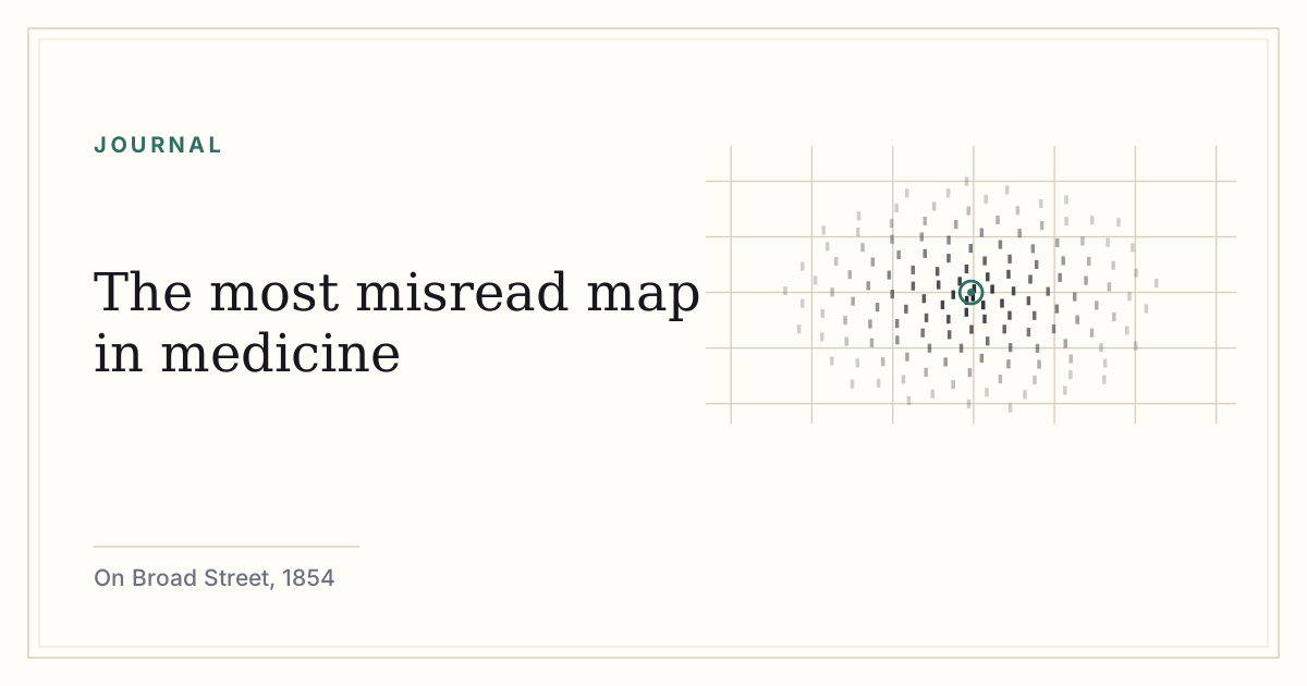
In the last week of August 1854, cholera broke out in a dense pocket of Soho around Broad Street — now Broadwick Street, a few minutes’ walk from Oxford Circus. It killed with the speed that made the disease so frightening: healthy in the morning, dead by evening, hundreds of deaths inside a fortnight in an area of a few hundred yards.
John Snow lived nearby and had been arguing for years that cholera was waterborne. This was a minority position. The dominant explanation was miasma — disease carried in foul air — and it was held by serious people, including William Farr at the General Register Office and Edwin Chadwick, the leading sanitary reformer of the age. Miasma was not stupid. It fit the observation that cholera flourished in stinking, crowded districts. It was simply wrong about the mechanism, and being wrong about the mechanism meant the recommended interventions were about ventilation and smell rather than water.
Snow went out and collected addresses of the dead, and drew a map with a mark for each death at the house where it occurred. The marks pile up in black stacks along Broad Street, thinning as you move outward, centered on the public pump.
Where the standard story goes wrong
Three corrections, in increasing order of importance.
First, the pump handle. Snow presented his findings to the parish Board of Guardians of St James, and the handle was removed on 8 September 1854. By that date the outbreak was already in steep decline — many residents had fled the district, and the case count had been falling for days. Removing the handle was the right decision on the evidence and it plausibly prevented a second wave, but it did not stop the epidemic. The epidemic was mostly over.
Second, the map did not find the pump. This is the one that surprises people. Snow had reached his conclusion about the Broad Street water before he drew it; the map was made afterwards, for the report, and its job was to make the case legible to a committee. Historians of the episode — Tom Koch and Howard Brody among others — have made this point carefully. The map is a work of persuasion built on a conclusion already reached by shoe-leather investigation, not the instrument of discovery it is usually presented as.
Third, and least known: the map was not even Snow’s strongest evidence. That was the study he called his grand experiment. South London was supplied by two competing water companies whose pipes ran down the same streets, serving neighboring houses. The Lambeth company had moved its intake upriver, above the sewage outfalls, in 1852. The Southwark and Vauxhall company had not. Snow worked out which houses were served by which company and compared cholera mortality between them. Same streets, same air, same class, same rubbish, different water — and a large difference in deaths. As a piece of epidemiological reasoning that is far more powerful than a cluster around a pump, because it isolates the variable. It is also almost impossible to draw.
Snow used the exceptions as hard as the cluster. A workhouse inside the affected area had very few deaths — it had its own well. A brewery on Broad Street lost no one — the workers drank beer and the brewery had a separate supply. A widow in Hampstead, miles away, died of cholera because she liked the taste of Broad Street water and had it carried to her. Anomalies that survive scrutiny are stronger than the pattern they interrupt.
The second version of the map
For the 1855 edition of his monograph, Snow redrew the map with an addition: a boundary line enclosing all the addresses from which the Broad Street pump was the nearest pump by walking distance along the streets. It is, in effect, a hand-computed travel-time catchment — the same idea a modern analyst reaches for when they build a service-area polygon.
That line is the map’s real methodological contribution, and it is usually cropped out of reproductions. It converts a suggestive cluster into a testable prediction: if the pump is the source, deaths should respect this boundary rather than simple radial distance. Mostly they do.
He did not live to be proved right
Snow died in 1858, aged 45, of a stroke. Germ theory was not yet established. Vibrio cholerae had in fact been observed under a microscope by Filippo Pacini in Florence in 1854 — the same year as Broad Street — and the work went almost entirely unnoticed; Robert Koch identified the organism independently in 1884 and got the credit. Snow’s own reputation as the founder of modern epidemiology was largely built after his death, and the map became its emblem.
He was also, separately, one of the first serious practitioners of anaesthesia, and administered chloroform to Queen Victoria at the birth of Prince Leopold in 1853. It is a strange double career and the anaesthetic work was better appreciated in his lifetime.
Why the correction matters
The mythologised version teaches that if you plot your data you will see the answer. That is a bad lesson, and a dangerous one for anyone learning to analyze anything. The Broad Street map is not a story about a visualisation revealing a hidden truth. It is a story about a man who developed a hypothesis, tested it against a natural experiment involving hundreds of thousands of people, hunted down the exceptions, and then built a picture to convince a committee that had the power to act.
The map came last. It usually does.
Sources and further reading
- Snow, John. On the Mode of Communication of Cholera, 2nd edition, much enlarged. London: John Churchill, 1855. Contains both the Broad Street map with the walking-distance boundary and the South London water-supply comparison.
- Report of the Cholera Inquiry Committee of the Parish of St James, Westminster, 1855 — includes the investigation by the Rev. Henry Whitehead, who traced the likely index case at 40 Broad Street.
- Koch, Tom. Cartographies of Disease, on the map’s composition and its later mythology.
- Brody, H. et al. “Map-making and myth-making in Broad Street,” The Lancet, 2000.
- Pacini, Filippo. Observations on the cholera organism, 1854; Koch, Robert, identification of Vibrio cholerae, 1884.
How we source and check these essays · Spotted an error? lumingrade@gmail.com